Rebuilding My Homepage as an Interactive Orbital System
I’m not a web developer, but with Codex I turned a static portfolio into a working orbital interface—and spent more time shaping the product than wrestling with syntax.
[systems debrief] 8 sections
I had been looking at my homepage for a while knowing that it said the right things but did not really feel like me. It was clear, tidy, and familiar: introduction at the top, sections below, links to the rest of the site. Nothing was wrong with it. It just felt more like a document than a system.
I wanted movement, depth, and a sense that the different parts of my work were connected. The idea in my head was an orbital interface, but not a space-themed website. More like an engineering model that happened to be alive.
There was an obvious problem: I am not a web developer. I work mainly in mobile engineering and production systems. I can read web code and reason about the behaviour, but complex CSS animation is not where I spend my day. In the past, that gap would probably have kept this as a sketch. This time I used Codex to close it.
Where the leverage came from
The loop became much faster.
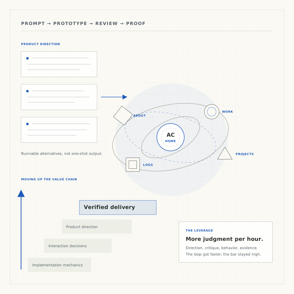
I could move from an idea to something I could click, reject, combine, and test in hours. Codex handled much of the unfamiliar web work. I stayed responsible for the direction, the tradeoffs, and whether the result held together as a product.
That let me spend less time translating an idea into syntax and more time deciding what the idea should become. That is what moving up the value chain looked like in practice.
Starting wider than one design
We began by looking at the existing site rather than starting with a blank canvas. The type, colours, thin structural lines, and generous empty space already had an identity. I wanted to keep that and change the way the homepage behaved.
Instead of asking for one polished answer, I had Codex build seven working directions. They ranged from a mechanical instrument to a spatial map, a kinetic sculpture display, and a knowledge graph. The point was not to choose a theme from a mood board. I wanted to use each version and see what felt natural.
The early set still played things too safely. Several versions looked different at first glance but had almost the same interaction underneath. I pushed the experiments further apart. Once each one behaved differently, comparing them became useful. I could tell which ideas were interesting only in a screenshot and which ones remained interesting after a minute of use.
The final homepage did not come from a single winner
I ended up liking fragments from several versions. One had the loose elliptical movement I was after. Another could rotate from an angled orbit into a top view. The spatial-map version handled selection well and kept a small map of the whole system visible. A sculpture experiment gave each destination its own geometric character.
We combined those pieces into a new version rather than forcing one experiment to carry everything. I also brought back parts of the old homepage that should never have disappeared: the direct introduction, the subtle moving background, and the small amount of blue that gave the page some life.
Keeping the introduction outside the orbit was especially important. Some prototypes made the centre another object that had to be opened. It looked clever, but it hid the most basic answer a homepage needs to give: who is this person and what do they do? The orbit became a way to explore, not an obstacle before the content.
Most of my feedback was not about code
I reviewed the prototypes the same way I would review a product. I sent screenshots. I pointed out when a panel felt too much like a table, when an animation drew attention to itself, or when a preview appeared too far from the thing it described. I noticed when there was no clear route back home and when too many borders made the page feel boxed in.
The words needed work too. Some labels overlapped with the site's main navigation while meaning something slightly different. Work history and highlighted projects felt like the same destination. Several links led to About without making the difference clear. Fixing that information structure did more for the homepage than adding another visual effect would have.
This was the part of the process that surprised me least. I did not need to know the CSS behind a problem to know that the experience was wrong. I could describe the behaviour I expected, review the next version, and keep narrowing the gap.
When the motion felt wrong, it usually was
One orbiting object kept making tiny jumps and sometimes looked as if it became stuck near the edge. It was easy to see and hard to ignore. Codex traced it to a collision system that was adjusting the position of the nodes on every frame. The code was trying to keep everything tidy, but those corrections were fighting the orbit itself.
We removed the collision adjustments and let each object follow its own continuous path. That meant accepting that an object might briefly overlap another one or move partly off-screen. I preferred that to motion that looked nervous and artificial.
A smaller vertical hop remained. This time the problem was depth. The animation used a handful of rounded depth levels for both perspective and stacking order, so moving between levels caused a visible step. Using smooth depth for the transform and rounded values only for front-to-back order fixed it.
Later we turned one of the nodes into a comet. It speeds up as it approaches the centre, slows down as it moves away, and carries a fading trail. Even that took a few passes. A comet tail should point away from the centre of the system, not simply follow behind the direction of travel. Once that was corrected, the movement finally made sense.
Mobile exposed every shortcut
The first compact layout simplified the idea too far. The orbits collapsed into one path, the centre disappeared, some nodes spent too long out of view, and the map competed with the content. It technically fit on a phone, but it no longer felt like the same homepage.
We gave the mobile version more vertical room instead. The page became scrollable, with separate space for the introduction, the moving system, and the map. It kept multiple paths, a visible centre, animated geometry, focused details, and a reliable way to dismiss them. We tested short phones, portrait and landscape layouts, tablets, touch targets, and reduced motion rather than trusting one responsive preview.
Sound produced another small lesson. At one point it seemed broken even though the code was there. The local server was not the problem; the browser was waiting for the first deliberate interaction before allowing audio. Once that behaviour was handled properly, the cues worked without adding a fake autoplay workaround.
The part Codex could not own
None of this worked because the first output was excellent. It was useful because it gave me something real to react to. I still had to decide which ideas belonged together, which labels were misleading, when an animation had crossed from calm into distracting, and which imperfections I was willing to accept.
My mobile background helped more than I expected. State, navigation, touch behaviour, lifecycle, accessibility, and release discipline transfer across stacks. I did not suddenly become a front-end specialist, but I could bring engineering judgment to a front-end problem while Codex handled much of the stack-specific implementation.
There is a version of AI-assisted development that produces more code and calls that progress. I am not interested in that. The useful version gives me more chances to compare, test, and improve an idea before the cost of iteration becomes too high.
Finishing still meant proving it worked
The homepage eventually passed its focused desktop and mobile checks, the full production build, and the site's browser suite across 32 routes. We checked keyboard and touch interaction, focus, browser history, reduced motion, small screens, overflow, readable content without JavaScript, and the live page after deployment.
That last part matters. A local demo, a successful build, and a working public page are three different things. The speed of the iteration did not change the need to separate them.
What changed was the size of the surface I could responsibly own. I was able to take an idea in an unfamiliar stack, shape it through many working versions, follow the technical problems when the behaviour felt wrong, and carry it through verification. I spent less time asking how to express every detail in web code and more time deciding whether the result was clear, coherent, and worth shipping.
That is the real gain for me. Not skipping the work—working at a higher level, with a much faster path from judgment to result.